A beautiful vintage modern bathroom makeover full of contrast and fun patterned tile.
It's week six of the One Room Challenge, which means it's REVEAL day! I honestly didn't think I would make it to this day, but somehow I managed to turn our bright orange bathroom into the perfect vintage modern space. It wasn't always easy and it came with a few frustrations, but the room is complete and I couldn't be happier with how it turned out. You can follow along on the room progress here: Week 1, Week 2, Week 3, Week 4, week 5.
This bathroom is teeny tiny and hard to photograph, but I did my best and hope you'll enjoy the space as much as I do.
Come on in, I'll show you around! Affiliate links have been used to link to products used in the space.

I'm having a love hate relationship with the wood mirror. I had my heart set on a pharmacy mirror, but the one I ordered and planned on painting ORB was too large for the space. I've been searching for the perfect round or rectangular ORB mirror ever since and still haven't found the one. In the meantime, I found a nice wood round mirror that will do for now.
Have you tried Beekman 1802 products before? My mom gave me a bunch for Christmas and I love them. They smell and feel great, but they also make a great accessory for the bathroom too.
Can we talk about the gorgeous tile for a minute?
Replacing the generic ceramic tile with the gray and white patterned tile completely changed the look of the space and I couldn't be happier with how it turned out. I'm so glad I ignored my husbands discontent regarding the tile and did it anyway. It's easier to ask for forgiveness than permission, right? #happywifehapylife
I never used this bathroom in the past (my husband always claimed it as his "office"), but I think we might be fighting over it now.
A HUGE thank you to Schoolhouse Electric for providing product to help transform our bathroom.
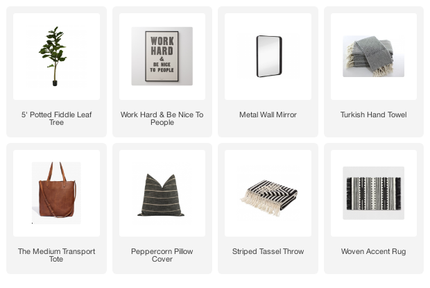
If you are interested in any of the sources in our bathroom you can find them here:
- Door Color: Sherwin-Williams Iron Ore
- Wall Color: Sherwin-Williams On The Rocks
- Ladies and Gents signs - local vintage market (I did find a few of the exact ones on Ebay)
- Tile
- Rug
- Artwork
- Light
- Mirror
- Plant
- Towels (similar) I found mine on clearance at HomeGoods


I was so anxious to see your completed room because I loved the door color and tile already. It's amazing! I'm so glad you used that tile. The rest of the styling is great, too. Now it is time to enjoy. Congrats! Susie from The Chelsea Project
ReplyDeleteThanks so much Susie! I'm glad I convinced my husband to let me do the tile too, it definitely makes the room.
DeleteAhh I'd totally steal this bathroom from my hubby too. It turned out SO GOOD! And I love the wood mirror actually, I think it pairs perfectly with all the other wood elements. And of course that tile is amazing!
ReplyDeleteThanks friend! The mirror is growing on me. You never know, maybe I'll just keep it :)
DeleteI'm so proud of you for doing all of that tile work yourself! This bathroom is SO pretty now - way too nice for a basement! :-) Loving the light fixture and I also like the wood mirror! :-)
ReplyDeleteThanks! I was dreading doing the tile, but it actually wasn't that bad and was totally worth the effort.
DeleteIt's absolutely amazing Katie! And your photography looks perfect (you'd never know you found it difficult)! The tile is just as gorgeous as I'd imagined and that light is SO amazing! LOVE. IT. ALL my friend!!!
ReplyDeleteThanks so much, Kristi! It was a major challenge taking pictures of this tiny space. I'm just glad it's over :)
Deletebeautiful space! Great little touches throughout. Enjoy your bathroom!
ReplyDeleteThanks so much Ariel!
DeleteKatie! I LOVE everything! The signs are a big favourite of mine. And then amazing tile, obviously! Gorgeous transformation!
ReplyDeleteI'm so glad you like the space. The sign is one of my favorites too :)
DeleteAhhhh! Loving this pretty little bathroom makeover! Just look at that floor! holy cow! and the rug, and the mirror, and the decor! Nicely done :)
ReplyDeleteThank you! I'm so glad you love everything :)
Deletekatie, it looks awesome! i love the tile, the art, light fixture! everything looks awesome!
ReplyDeleteThanks so much, Cassie!
DeleteYou are inspiring me to start on my powder room! It looks so good. I'm really liking the mirror personally, but I totally get that it's not the one that you wanted!
ReplyDeleteThanks Ashley! The mirror is definitely growing on me :)
DeleteSuper cute! Looove the 'ladies/gents' signs...so adorable! Haha, I also have that dot art from Target.
ReplyDeleteThanks Ursula! Great minds think alike :)
DeleteI love seeing your reveal! It was fun to watch along with you the changes that you made. I agree with you about the mirror, it looks out of place. What if you painted the wood a chalkboard slate color?
ReplyDeleteThanks Debbie! That's a good idea if I can't find another one I like better.
DeleteSo gorgeous, I love it!! I really love the tile, and the mirror works great in the space!
ReplyDeleteThanks so much Meg! I've always loved the tile and can't believe I finally have it in my home. Who knew I would enjoy walking into a bathroom so much, haha.
DeleteThat tile... is .. AMAZING!! I love how this room came together. Everything looks so pretty and serene I love it. Great job!! Also love the cute eucalyptus spring for some greenery!
ReplyDelete>> Christene
Keys to Inspiration
Gorgeous!! Where is the toilet paper stand from?
ReplyDeleteThat tile makes my heart pitter patter! I'm so glad you stuck to it because it truly does make that space :)
ReplyDeleteSo crisp & fresh, yet still cozy & stylish..PERFECT!
ReplyDeletePaige.Rose
from
www.TheQuaintSanctuary.blogspot.com
Absolutely gorgeous!! The tile is my favorite...I would have fought for that too. And I like the mirror you have in there now. It balances the wood shelving above the toilet. XO
ReplyDelete
ReplyDeletekatie i was just scrolling around looking at mirrors because i could almost hear your disappiontment this isn't like the one but i think you will like it xx
https://www.bseid.com/ProductDetails.asp?ProductCode=CQ6601&gdffi=bed6f1cf3bce44d7af73f4d89382a1c4&gdfms=CD49A20C6D224FBFA413AFDC8D889B71&gclid=CKiUrdePy80CFYpufgodyk4HLw
It's gorgeous, Katie! The tile is beautiful. I actually really like the wood mirror too!
ReplyDeleteOh I love it! Starting with the signs on the door, such a cute detail! The tile, light, and wood is such a pretty combination. Great job, enjoy it!
ReplyDeleteThis room turned out fantastic! I understand that you can never have to much ORB, but i think the mirror also brightens and lightens the space.It also ties in with the lighter color of wood shelf, the baskets, and the light.
ReplyDeleteWhat a great transformation! I actually really like the wood mirror. Great work!
ReplyDelete-Shonee
How pretty is that tile?! I looove it! The little ladies and gents signs on the door are pretty awesome too!
ReplyDeleteThose floors are amazing, has your husband come around to liking them yet? The wood mirror does go with the other wood accessories in the room, but I'm thinking a dark one might be better too - it's an amazing space though!
ReplyDeleteYour bathroom is stunning, Katie! I ovjust e that mirror too... all of it is just perfect!
ReplyDeleteThis bathroom makeover looks fantastic, and I just love the tile!
ReplyDeleteYour bathroom turned out beautifully! Great job! I have featured your bathroom makeover on a round-up of my favorites!!!
ReplyDeletehttp://myoldcountryhouse.com/one-room-challenge-guest-stars-fantastic-bathroom-makeovers/
Love everything! Where did you the shelf above the toilet?
ReplyDeleteI love your new bathroom, especially the tiles! I know your not to happy with the mirror but I love the beauty of the natural wood with the gray and black. The mirror is simply stunning and goes well with the wood shelf above the toilet. Great job!!
ReplyDeleteIt says your paint color is Sherwin Williams "On the Rocks". Just looked at this on my fan deck and it is quite dark with an LRV of 66. I assume you had this lightened significantly? Love the paint color in the photos, but it doesn't look like the paint chip.
ReplyDeletewow what a transition! You have inspired me..we will be redoing our small 1/2 bath and I love that tile!
ReplyDelete